The Butter Yellow Revival Takes a Wrong Turn
Butter yellow is making a major comeback in interior design as homeowners embrace warmer, more personality-driven spaces over stark monochrome aesthetics. According to reports, this nostalgic hue offers a welcome departure from the cool, minimalist palettes that have dominated recent years. However, interior designers are sounding the alarm about one critical styling mistake that can instantly make this trending color look outdated.
The Dating Trap: Cool Colors Kill the Vibe
The biggest mistake homeowners make with butter yellow, according to design professionals, is pairing it with cool-toned elements. Specifically, designers warn against combining this warm, sunny shade with cool grays, blues, silvery finishes, or whitewashed wood pieces.
This combination reportedly pushes butter yellow spaces into early-2000s territory, creating a dated aesthetic that undermines the color's potential to feel fresh and current. The cool undertones clash with butter yellow's inherently warm nature, creating a visual disconnect that feels more nostalgic than intentionally vintage.
The Right Way to Style Butter Yellow
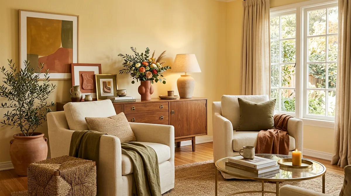
To keep butter yellow feeling contemporary and elevated, designers recommend embracing its warm undertones through strategic color and material pairings. According to reports, the most successful butter yellow spaces incorporate warm neutrals and earthy tones that complement rather than compete with the color's sunny disposition.
Warm Neutrals and Natural Materials
Designers suggest pairing butter yellow with natural materials that enhance its organic appeal. This approach reportedly helps ground the color while maintaining its cheerful energy. The key is selecting materials and finishes that share butter yellow's warm temperature, creating a cohesive and intentional design scheme.
Metal Finishes That Work
When it comes to hardware and fixtures, designers recommend brass and bronze finishes over cool-toned metals. These warm metallic accents reportedly complement butter yellow's golden undertones, creating a sophisticated and pulled-together look that feels both nostalgic and current.
Wood Selections Matter
Instead of whitewashed or gray-toned woods, design professionals suggest incorporating vintage wood pieces with warm undertones. This choice reportedly enhances the overall warmth of butter yellow spaces while avoiding the dated combinations that can make rooms feel stuck in the past.
Why Butter Yellow Works Now
The timing for butter yellow's comeback couldn't be better, according to reports. As people move away from stark, impersonal interiors, there's a growing appetite for colors that inject personality and warmth into living spaces. The shade's '90s revival appeal taps into current nostalgia trends while offering a more optimistic alternative to the moodier colors that have dominated recent design cycles.
This shift toward warmer, more expressive interiors makes butter yellow particularly relevant for homeowners looking to refresh their spaces without committing to a complete overhaul.
Making the Trend Work for You
For those inspired to incorporate butter yellow into their homes, the key is understanding the color's warm nature and selecting complementary elements accordingly. According to design professionals, success with this trending shade comes down to creating cohesive temperature relationships throughout the space.
This means avoiding the temptation to balance butter yellow with cool tones and instead embracing the full spectrum of warm colors and materials that enhance its natural appeal. By following this approach, homeowners can achieve the fresh, personality-filled spaces that make butter yellow such an appealing choice for modern interiors.
The butter yellow trend offers an opportunity to create spaces that feel both current and timeless, provided the styling avoids the common pitfalls that can make this sunny shade feel more dated than delightful.